Back to Asset Essentials Main Menu
Dashboards for Manufacturing
Analytics provides maintenance overview dashboards that allow you to drill down into your applications' data giving you a bigger picture into the work your organization is doing. *Note: Not all clients are eligible for Analytics. To learn if you are eligible, contact Client Services.
Your dashboard updates every morning with the current year's data through the previous day as well as two previous calendar years of data. You can see the Last Updated time stamp in the top left corner of your dashboard. *Note: Time shown is in Eastern time zone.
Within some dashboard tables you may be able to expand categories ( ) to view a further breakdown of your data. Also keep an eye out for triangle icons (
 ) in the x- and y-axis titles of the dashboard charts. This indicates that there are other metrics that can be selected for that chart.
Maintenance dashboards
The Dashboard is the default view you will see when you access Analytics. To get back to it if you navigate away:
-
Click the Maintenance menu icon, then select Dashboard.
-
Use the View by: drop-down in the top center of the screen to select the dashboard you want to view.
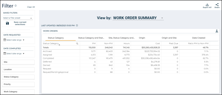
This dashboard provides you with a summary of work order counts to view a snapshot of your operations across your organization.
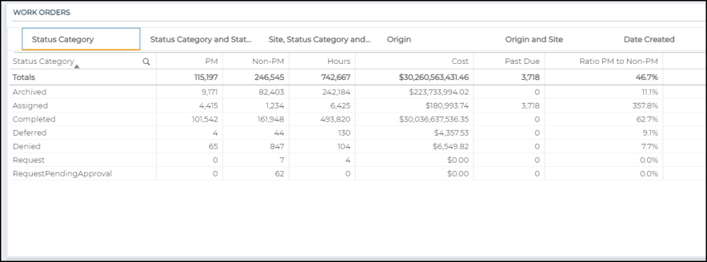
Work orders
Click the tabs at the top of this section to view the available tables:
-
Status Category: Work order counts by Status Category
-
Status Category and Status: Work order counts by Status Category and Status
-
Site, Status Category and Status: Work order counts by Site, Status Category and Status
-
Origin: Work order counts for PM vs. Non-PM work
-
Origin and Site: Work order counts by Origin and Site
-
Date Created: Line graph that displays number of created work orders over time
-
Metrics for Status Category, Status Category and Status, and Site, Status Category and Status:
-
PM: Number of PM work orders (Origin Type is PM).
-
Non-PM: Number of Non-PM work orders (Origin Type is Non-PM).
-
Hours: Sum of total hours.
-
Cost: Sum of total cost with tax.
-
Past Due: Count of the number of past due work orders. A work order is past due if the Status Category is "Assigned" and the Expected date on the work order is before the current day.
-
Ratio PM to Non-PM: Number of PM work orders divided by the number of Non-PM work orders.
-
-
Metrics for Origin and Origin and Site:
-
Assigned: Number of work orders where Status Category is "Assigned".
-
Completed: Number of work orders where Status Category is "Completed".
-
Percent Completed: Number of work orders where Status Category is "Completed" divided by number of work orders where Status Category is "Assigned" or "Completed".
-
Hours: Sum of total hours.
-
Cost: Sum of total cost with tax.
-
Past Due: Count of the number of past due work orders. A work order is past due if the Status Category is "Assigned" and the Expected date on the work order is before the current day.
-
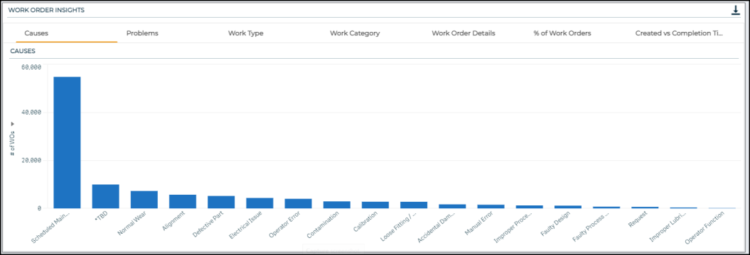
Work Order Insights
Click the tabs at the top of this section to view the available tables and graphs. Use the triangle icon ( ) in each graph to change what is being measured in the graph.
-
Causes: Displays the number of work orders, total work order cost, or total work order hours by Cause.
-
Problems: Displays the number of work orders, total work order cost, or total work order hours by Problem.
-
Work Type: Displays the number of work orders, total work order cost, or total work order hours by Work Type.
-
Work Category: Displays the number of work orders, total work order cost, or total work order hours by Work Category.
-
Work Order Details: Table that displays individual work order data with important fields such as Site, Location, Origin, Status, and more.
-
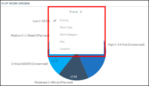
% of Work Orders: Pie chart that displays the percentage of work orders by Priority, Work Type, Work Category, Site, or Location.
-
Created vs Completion Time: Line graph that displays the number of work orders that were created or completed during a specific hour of the day.
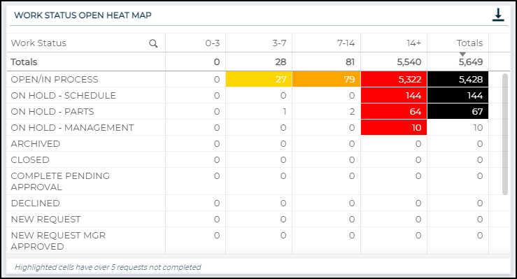
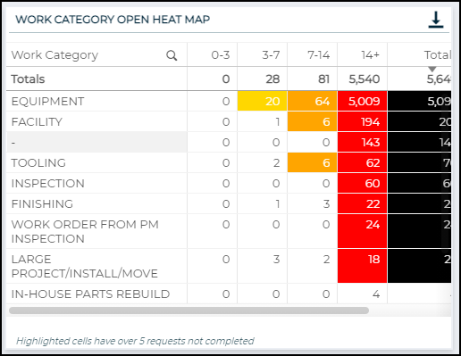
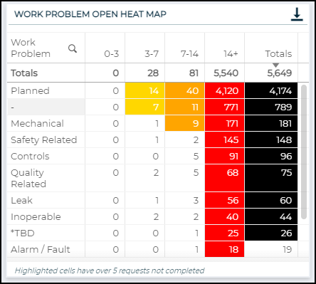
This dashboard shows open work order counts grouped by days aged, such as 0-3 days or 7-14 days, to identify barriers within your operations.
-
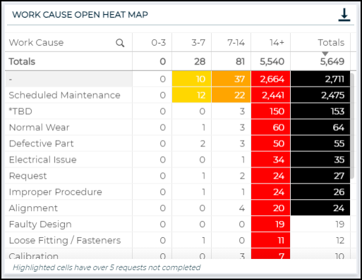
Cells that are highlighted have over 5 open requests.
-
Each column is highlighted with a different color to indicate the increase in time.
-
The Totals column is highlighted when there are over 20 requests.
-
Open requests include work orders that display any of the following keywords in the Status field: "In Progress", "Open", "New", "Approve", or "Incomplete".
Work Status Open Heat Map
Displays a count of work orders, sorted by Work Status, that have been open for a specific number of days, such as 0-3 days or 7-14 days.
Work Priority Open Heat Map
Displays a count of work orders, sorted by Priority, that have been open for a specific number of days, such as 0-3 days or 7-14 days.

Work Category Open Heat Map
Displays a count of work orders, sorted by Work Category, that have been open for a specific number of days, such as 0-3 days or 7-14 days.
Work Problem Open Heat Map
Displays a count of work orders, sorted by Work Problem, that have been open for a specific number of days, such as 0-3 days or 7-14 days.
Work Cause Open Heat Map
Displays a count of work orders, sorted by Work Cause, that have been open for a specific number of days, such as 0-3 days or 7-14 days.
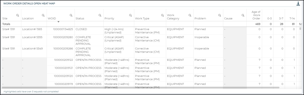
Work Order Details Open Heat Map
This table displays open work order details and shows which day range each work order falls into, such as 0-3 days or 7-14 days.
This dashboard gives insight into the allocation of work across your teams, their productivity, and how to increase efficiency at your organization.
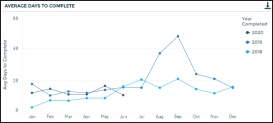
Average Days to Complete
Displays a trend showing the average number of days to complete work orders throughout the year.
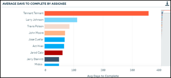
Average Days to Complete by Assignee
Displays the average number of days it takes to complete work broken down by assignee.
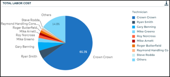
Total Labor Cost
Displays a pie chart showing the percentage of labor cost tracked, broken down by assignee.
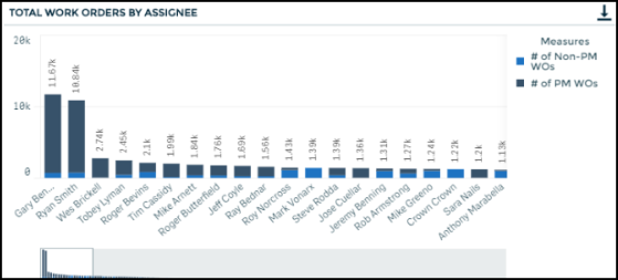
Total Work Orders by Assignee
Displays the total number of PM and non-PM work orders, based on the origin field, broken down by assignee.
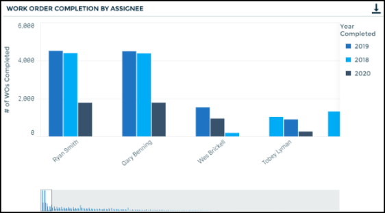
Work Order Completion by Assignee
Displays the number of work orders completed per assignee per year.
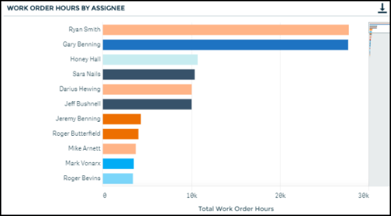
Work Order Hours by Assignee
Displays the total number of labor hours per assignee.
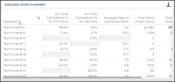
Assignee Work Summary
Displays the PM on-time completion percentage, average days to complete non-PM work, total work order hours and costs per assignee.
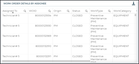
Work Order Details by Assignee
Displays a table with work order details including the assignee and how many days it took to close the work order.
This dashboard summarizes recent maintenance trends and asset characteristics to provide insight into how assets are performing, and which assets may need work and attention. We have included an Asset Health rank to enable you to prioritize attention to higher risk assets. This priority ranking is based on non-PM trends, critical non-PM trends, PM trends, and recent WO cost.
In order to receive an Asset Health rank based on each key component, there are certain eligibility criteria that need to be met by the asset.
-
The eligibility criteria include assets that are up and functioning (based on keywords in the Asset Status field), assets with at least 12 months of work orders, and assets with at least 10 work orders over the last 12 months.
-
If an asset is ineligible to receive an asset health rank, it will receive a rank of Ineligible. Even if an asset is ineligible to receive a ranking, you will still be able to click on any asset to view trends and KPIs, but those assets will not rise to the top of the Asset Health ranking list.
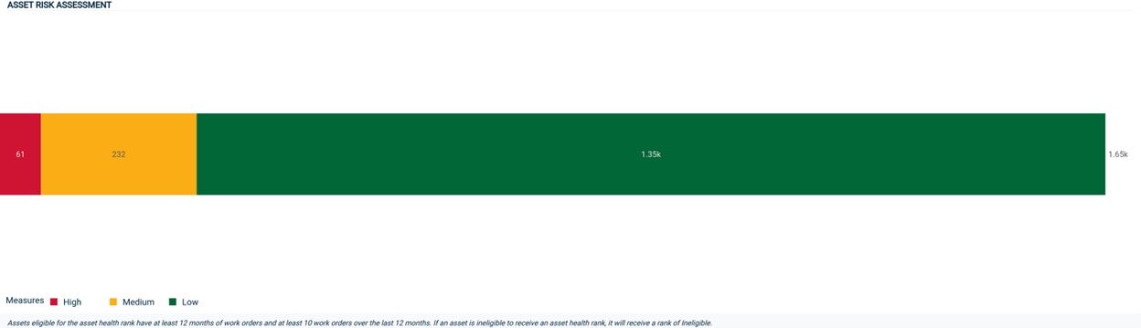
Asset Risk Assessment
This chart displays a count of all of your eligible assets by Asset Health rank. Ineligible assets will not appear in this chart. It allows you to quickly see the proportion of assets falling into each risk category. This chart will update with any selected filters, so you can quickly view the proportion of an asset risk category by different dimensions, like Site or Asset Category.
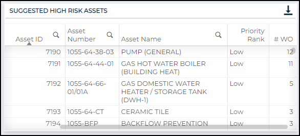
Suggested High Risk Assets
Displays a list of assets prioritized by an Asset Heath rank that is based on the asset's recent maintenance history. The priority rank helps you to see which assets might be in need of major repair or replacement indicated by the amount of work done to the asset. The list is sorted by the priority rank and then secondarily sorted by the number of Work Orders.
Preventative vs. Reactive Work Orders
This chart provides a view of the number of Preventative Work Orders vs. Non Preventative Work Orders at your organization. This chart can be especially useful as you dig deeper into particular sites and assets that are High or Medium risk.

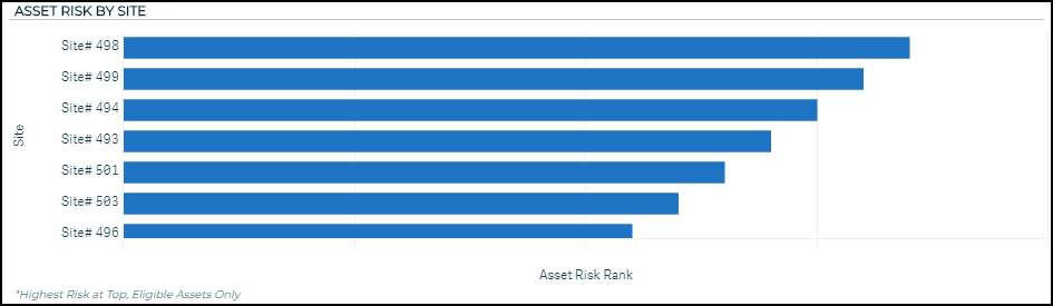
Asset Risk by Site
This chart provides a summary of the average Asset Risk rank by Site. The chart is sorted by highest average risk rank and allows you to filter into sites that have the highest risk assets.
Key Components in Asset Health Prioritization
The Asset Health rank is comprised of four components:
-
The Non-PM Trend component of the Asset Health ranking specifically considers the trend of non-PM maintenance over the past 12 months, as well as a seasonal comparison of non-PM over the past quarter, as compared to non-PM over the same quarter of the previous year (i.e., last quarter vs. 5 quarters ago).
-
The text identifies if non-PM work orders for the selected asset have been Trending Up or Trending Down/Steady.
-
The Critical Non-PM Trend component specifically focuses on the trends seen over the past 12 months in high priority work orders. Non-PM are deemed to be “Critical” if the work order priority field includes particular keywords, like “Emergency” or “Critical.”
-
The text identifies if critical non-PM work orders for the selected asset have been Trending Up or Trending Down/Steady.
-
The PM Trend component analyzes whether or not an asset has ever had any preventative maintenance, or currently has PM schedules. It also considers the recent trends in both the quantity of PM, as well as the time it takes to complete PM work orders.
-
The data from this component can be used to identify assets that have been deprioritized from a preventative maintenance perspective.
-
The text identifies if there has been a Favorable pattern or Unfavorable pattern recently in PM work orders for the selected asset.
-
The Recent WO Cost component looks for recent, singular costs tied to work orders that are significant. In this case, significant means that they amount to a sizeable portion of the asset’s value, which is determined by replacement cost. If replacement cost information is not available, it is determined by purchase price.
-
If a significant Work Order cost is noted, this asset will be given a lower priority ranking, because that cost likely indicates that a major repair occurred. For example, if an asset is worth $10,000 and recently receives a $5,000 repair, it is reasonable to assume that a significant part of the asset was replaced, which should improve the asset’s performance into the future. *Note: If there is no significant work order cost found, this component has no effect on the priority ranking.
-
The text indicates if a singular work order cost for the selected asset was Significant or Not Significant.
Below each component, there is more detail around what specific trends in the Asset Health components are driving the priority ranking. This gives you the ability to take a deeper look into the health of a particular asset. *Note: The descriptive notes will only populate if a specific asset is selected.

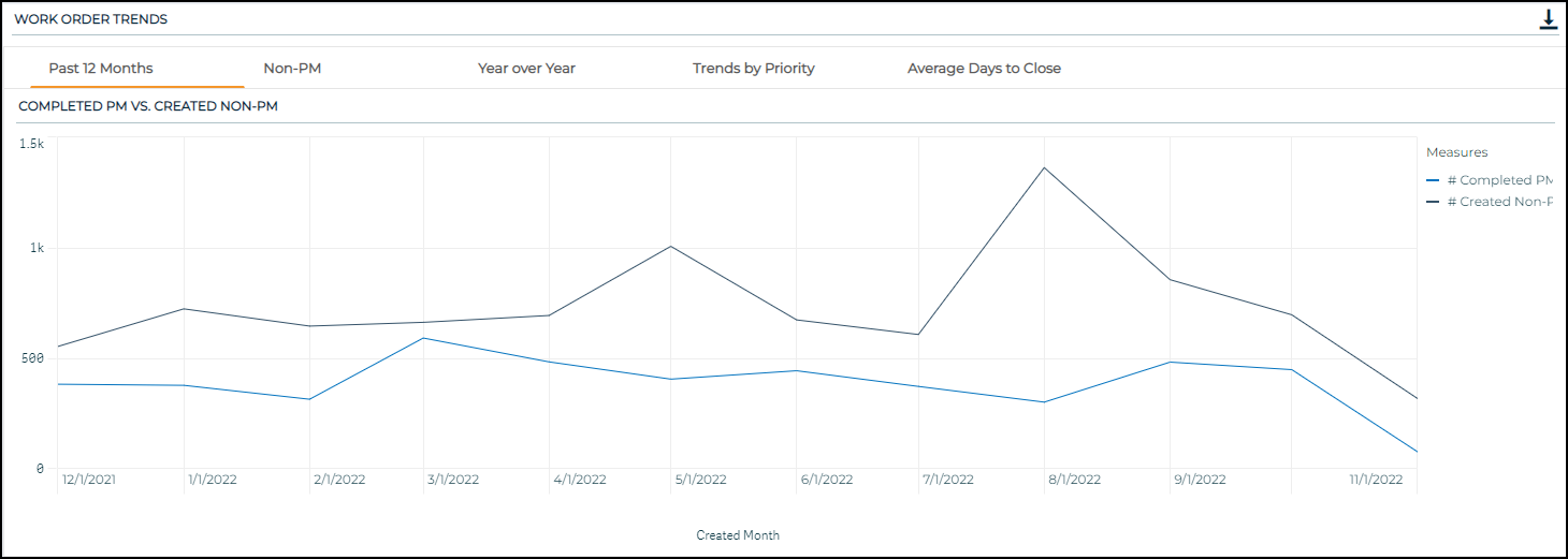
Work Order Trends
Displays a series of charts that allow you to dive deeper into the Asset Health priority components and visualize the recent trends associated with your assets. These charts will be most useful when a specific asset is selected.
-
Past 12 Months: This chart displays the number of non-PM work orders and PM work orders an asset has had over the past 12 months.
-
Non-PM: This chart shows the number of non-PM work orders an asset has had over the past twelve months, as well as an Upper Threshold and a Lower Threshold.
-
The thresholds are calculated by looking at the average number of non-PM work orders all assets in the same asset category have had and identifying the middle 50%, i.e., the 25th and 75th percentiles.
-
The thresholds serve to provide a better understanding of whether or not the number of non-PM work orders an asset has had is similar to the number of non-PM work orders similar assets have had.
-
-
Year over Year: This chart provides a comparison of the number of work orders an asset has had by different years. On the y-axis, you can select to view Created Non-PM Work Orders or Completed PM Work Orders.
-
Trends by Priority: This chart shows the work order counts over time by Work Order Priority.
-
Average Days to Close: This chart shows the average days to close work orders over time by both PM and non-PM, side by side.
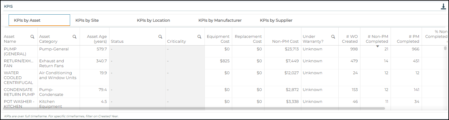
KPIs
Displays various KPIs by Asset, Site, Location, Manufacturer, and Supplier. Each table includes KPIs around asset value, total work order cost, work order counts, and work order completion.
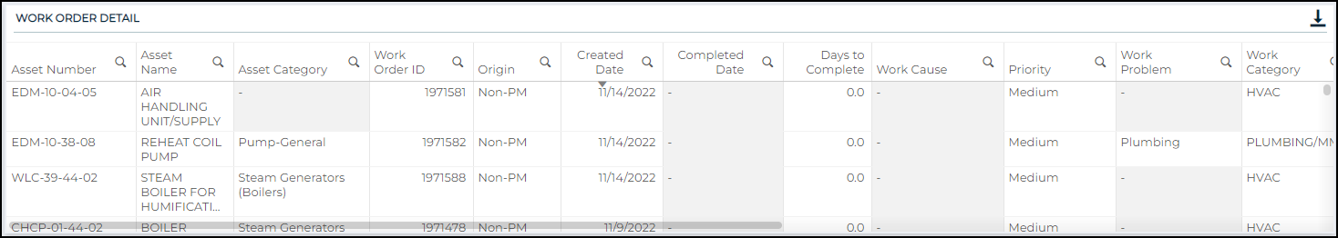
Work Order Detail
This table displays all the work orders related to the selected asset and includes the date created, date completed, description of the work, and whether the work order was a PM work order or a non-PM work order. This data gives you the ability to dive deeper into the particular work orders associated with a selected asset.
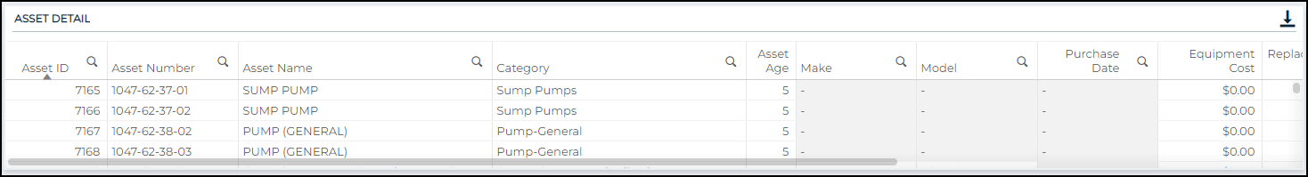
Asset Detail
This table displays various pieces of asset information, including the Asset Category, Make, Model, Purchase Date, Asset and Replacement Cost, Warranty Expiration Date, Asset Status, and Criticality.
This dashboard sheds light into how assets are performing and clearly identifies where attention might be needed to keep your operations running smoothly. *Note: A downtime work order is considered a completed, non-PM work order that is attached to an asset.
Runtime is determined differently on the Asset Downtime dashboard and the Meter Readings dashboard:
On the Asset Downtime dashboard, Runtime is equal to the time since an asset was purchased or added to the system, assuming the asset runs 24 hours a day, 7 days a week.
On the Meter Readings dashboard, Runtime is determined using the meter readings that belong to the meter titles on an asset.
In both of these views, Uptime is then derived by subtracting Downtime from Runtime.
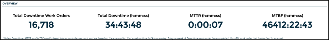
Overview
Displays the total number of completed downtime work orders, the sum of downtime, the total of mean time to repair (MTTR), and the total of mean time between failures (MTBF).
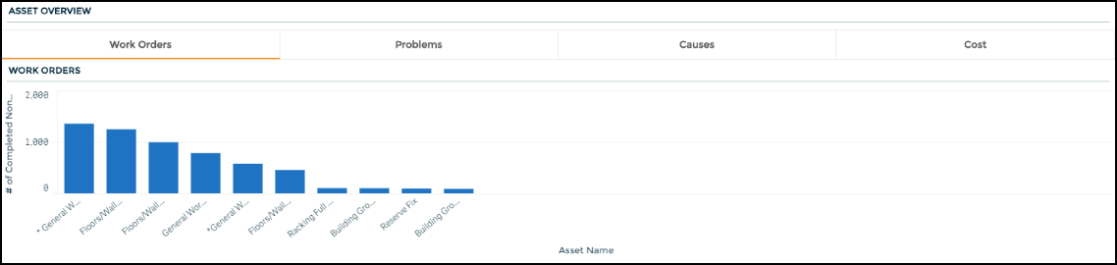
Asset Overview
Displays the number of completed downtime work orders by asset, problem, and cause, as well as the total cost of all downtime work orders per asset.
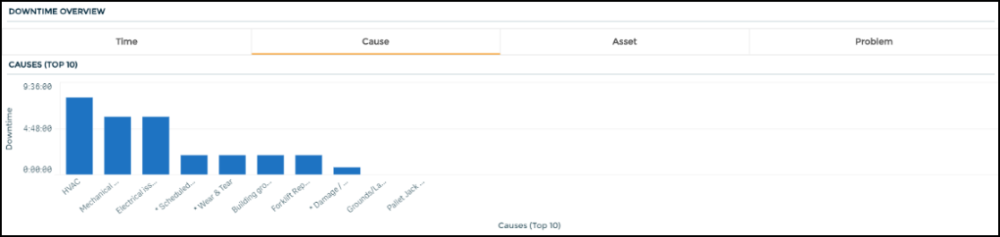
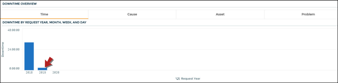
Downtime Overview
Displays the amount of downtime on completed work orders by cause, asset and problem.
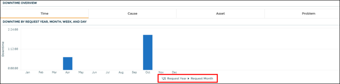
The chart also displays the amount of downtime on completed work orders by request year, month, week, and day.
- After selecting the Time tab at the top of the chart, you will see the data broken down by Request Year.
- To drill down further to see the months, weeks, and days for a specific year, click on the appropriate year's bar in the chart.
- Click the green checkmark to confirm your selection.
- The graph will refresh and now be broken down by the months within that year.
- You can continue to click on specific months, weeks, and days on the chart to drill the chart down even further.
- To go back to a previous selection, click the appropriate 'Request' link (
 ) in the x-axis depending on how far you want to drill back. For example, if you have drilled down to show each month within the year 2019, and you want to go back to just showing each request year, then you would click Request Year in the x-axis label.
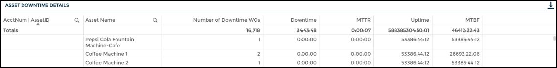
Asset Downtime Details
Displays a table with asset downtime details including the number of downtime work orders and the amount of downtime per asset.
This dashboard gives a detailed view of meter reading data showing asset downtime and uptime which can help you identify problem assets.
Runtime is determined differently on the Asset Downtime dashboard and the Meter Readings dashboard:
On the Asset Downtime dashboard, Runtime is equal to the time since an asset was purchased or added to the system, assuming the asset runs 24 hours a day, 7 days a week.
On the Meter Readings dashboard, Runtime is determined using the meter readings that belong to the meter titles on an asset.
In both of these views, Uptime is then derived by subtracting Downtime from Runtime.
Meter Reading Summary
Displays a table with asset details including the number of meter readings and number of downtime work orders per asset.

This dashboard helps you gain insight into the health of your assets based on meter reading trends over time. The filters on the left side of the dashboard allow for the selection of different Asset Categories, Asset Names and Numbers, Meter Names and Numbers, Years, and Months. *Note: Machine Health Summary data is only available for clients with meter readings in Asset Essentials. Learn more about entering Meter Reading data in Asset Essentials.
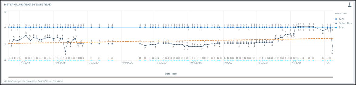
Meter Value Read by Date Read
Select a Meter (Meter Name and/or Meter Number) and an Asset (Asset Name and/or Asset Number) in the filter section in order for the graph to populate. This line graph contains four trendlines:
-
Value Read - represents the meter readings at different points in time.
-
Minimum Threshold - represents the user-defined minimum threshold for the selected meter.
-
Maximum Threshold - represents the user-defined maximum threshold for the selected meter.
-
Linear Trendline - appears as a dashed line on the chart and represents the best-fit regression line.
The slope, or incline, of the linear trendline is used to highlight meters that may be steadily approaching the minimum or maximum thresholds. For example, a linear trendline may reveal an increasing trend over time, whereas on a day by day basis, it may be difficult to see that values are steadily increasing.
The points on the line graph can be used to easily see when the meter reading is outside the set minimum or maximum thresholds. For example, if a meter measures the temperature of a certain asset, and the meter reading temperature value is above the threshold maximum during a certain time period, further investigation into the related work orders during that time period may help uncover if the asset was functioning optimally or needed a repair. Meter reading values that fall outside of the set thresholds, especially at an increasing rate, may also be a helpful leading indicator that an asset could be about to fail, and some preventive maintenance may be beneficial.
The linear trendline is derived by minimizing the sum of squared errors, or essentially minimizing the distance between the trendline and each actual value. The trendline is fit using the linear regression equation, y = mx + b.
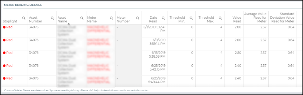
Meter Reading Details
This table provides the raw data for the information displayed in the line graph. It displays several columns, including Asset Number, Asset Name, Meter Title Name, Date Read, Value Read, Threshold Min. and Threshold Max, as well as a color-coded status indicator. The average and standard deviation of the selected meter’s readings are also calculated and shown at the end of this table.
The Meter Title Name is color coded as either red, yellow, or green. The color of the meter title reflects the relationship between the meter readings and the user-defined thresholds.
-
Red
 : The meter readings have exceeded the minimum or maximum thresholds in the past 365 days.
 -
Yellow
 : The meter readings have not exceeded the minimum and maximum thresholds but the slope of the linear trendline is either greater than 0.5 or less than -0.5, indicating that there is either a steep increase or steep decrease, respectively. This helps to highlight assets that may be steadily approaching either the minimum or maximum thresholds.
 -
Green
 : The meter readings are relatively stable. The values have not exceeded the minimum and maximum thresholds and the slope of the linear trendline is between -0.5 and 0.5, meaning the trendline is not too steep.
-
The Average Value Read for Meter column calculates the average value for the meter over all time. This can be used to compare individual meter readings to the overall average, especially the most recent readings.
-
The Standard Deviation Value Read for Meter column calculates the standard deviation of the values read for the meter over all time. The standard deviation represents the amount of dispersion in a set of values. This statistic gives an estimate for how far individual meter reading values tend to be from the average meter reading value. Higher standard deviations indicate that the meter reading values tend to be more spread out, which could be useful in anticipating meters that may exceed threshold values. It is also worth noting that standard deviation tends to be more sensitive to outliers, or large spikes in the meter reading data, which could be used to highlight meters that have had significant spikes and need attention, even if they have not exceeded the user-defined thresholds.
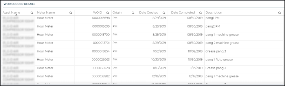
Work Order Details
This table displays all the work orders related to the selected meter and includes the date created, date completed, description of the work, and whether the work order was a PM work order or a non-PM work order. This data gives you the ability to assess the amount of maintenance associated with an asset in light of the status of its associated meters. For example, assets that have meters that are in either red or yellow status may benefit from additional or more frequent preventive maintenance. You also have the ability to see if a preventive maintenance schedule was created in response to a meter exceeding one of the user-defined thresholds, based on the date of the meter reading and the date of the work order.
This dashboard allows you view work order information at the site level to review operational effectiveness.
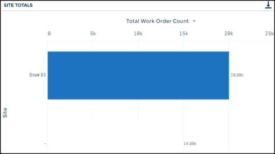
Site Totals
Displays the work order count by site. Use the triangle icon () to view total downtime, total work order cost, or total work order hours by site. *Note: The data reflected on this chart, when filtered to the Total Work Order Cost or Total Work Order Hours view, is split evenly for work orders tied to more than one site.
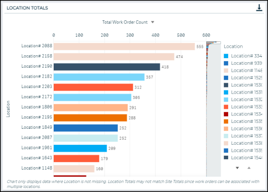
Location Totals
Displays the work order count by locations at the site. Use the triangle icon () to view total downtime, total work order cost, or total work order hours. *Note: The data reflected on this chart, when filtered to the Total Work Order Cost or Total Work Order Hours view, is split evenly for work orders tied to more than one site.
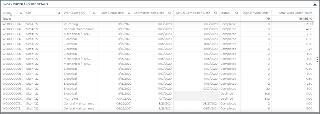
Work Order and Site Details
Displays a table with work order details including the age of the work order and the cost.
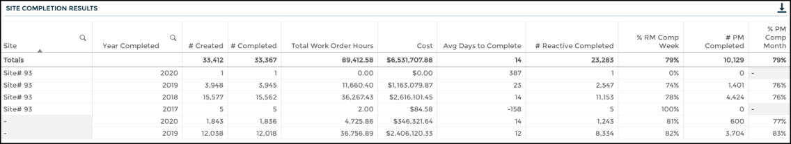
Site Completion Results
Displays a table with work order completion details for different calendar years. It only includes completed work orders for the top ten Sites.
This dashboard provides information about which assets are requiring the most investment in time and money. You can also identify how planned maintenance can decrease downtime.
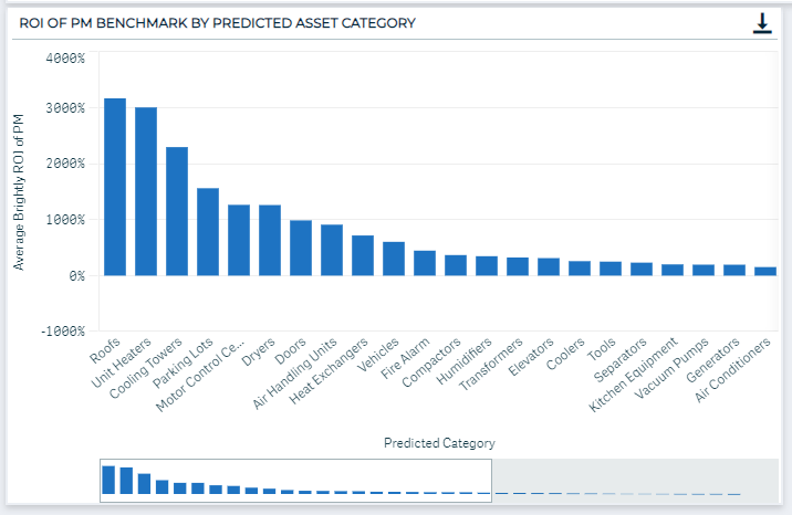
ROI of PM Benchmark by Predicted Asset Category
Displays the ROI of PM Benchmark for each predicted asset category. The information is displayed in a waterfall chart where the sizes of the boxes adjust based on how many assets you have in that category. The largest box corresponds to the predicted asset category with the most assets.
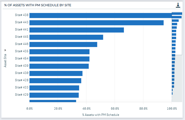
% of Assets with PM Schedule by Site
Displays the percentage of assets with a PM schedule by each site. This chart can help you understand which sites have the most assets with a PM schedule and which sites could benefit the most from a more enhanced PM program (use the triangle icon to view Site and Location).
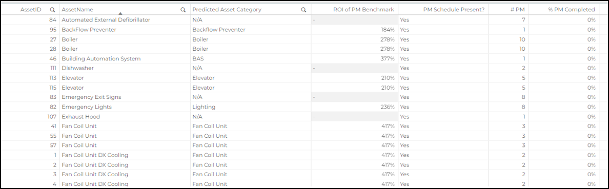
ROI of PM Benchmark Detail
Displays a table with information on each asset, including:
-
The asset's corresponding predicted asset category
-
ROI of PM Benchmark
-
Whether or not the asset has an active PM schedule
-
The number of PMs the asset has had over the dashboard time frame
-
The percentage of PMs that have been completed
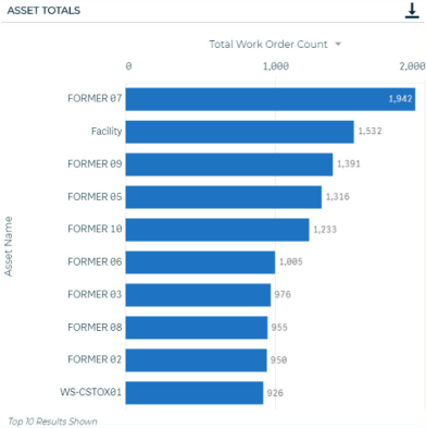
Asset Totals
Displays the work order count by Asset. Use the triangle icon () to view total downtime, total work order cost, or total work order hours. *Note: The data reflected on this chart, when filtered to the Total Work Order Cost or Total Work Order Hours view, is split evenly for work orders tied to more than one asset.
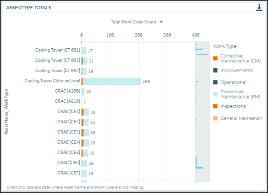
Asset/Type Totals
Displays the work order count by Asset and Work Type. Hover over a color to see the work order count for that specific Work Type. Use the triangle icon () to view total downtime, total work order cost, or total work order hours. *Note: The data reflected on this chart, when filtered to the Total Work Order Cost or Total Work Order Hours view, is split evenly for work orders tied to more than one asset.
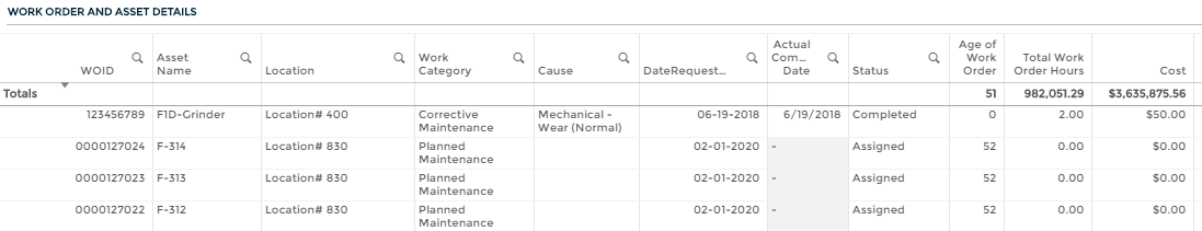
Work Order and Asset Details
Displays a table with work order details including the age of the work order and the cost.
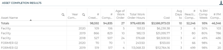
Asset Completion Results
Displays a table with work order completion details for different calendar years. It only includes completed work orders for the top ten Assets.
This dashboard helps you to learn more about the problems associated with work orders to determine trends in maintenance needs.
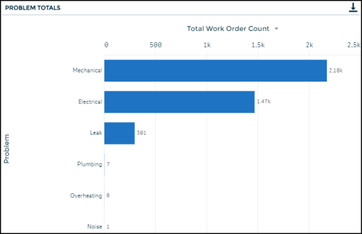
Problem Totals
Displays the work order count by Problem. Use the triangle icon () to view total work order cost.
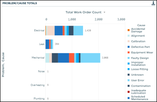
Problem/Cause Totals
Displays the work order count by Problem and Cause. Hover over a color to see the work order count for that specific Cause. Use the triangle icon () to view total downtime, total work order cost, or total work order hours.
Work Order and Problem Details
Displays a table with work order details including the age of the work order and the cost.

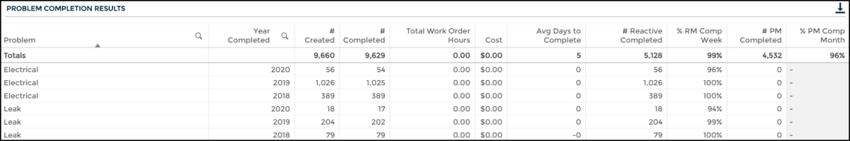
Problem Completion Results
Displays a table with work order completion details for different calendar years. It only includes completed work orders for the top ten Problems.
This dashboard allows you to learn more about the causes associated with work orders to determine trends in maintenance needs.
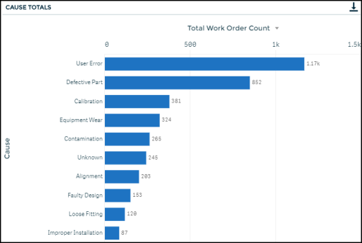
Cause Totals
Displays the work order count by Cause. Use the triangle icon () to view total work order cost.
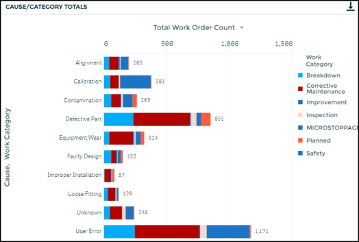
Cause/Category Totals
Displays the work order count by Cause and Work Category. Hover over a color to see the work order count for that specific Work Category. Use the triangle icon () to view total downtime, total work order cost, or total work order hours.
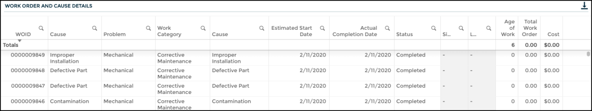
Work Order and Cause Details
Displays a table with work order details including the age of the work order and the cost.
Cause Completion Results
Displays a table with work order completion details for different calendar years. It only includes completed work orders for the top ten Causes.

This dashboard displays information around your organization’s maintenance tasks and helps ensure failing tasks receive appropriate follow up. It makes it easier to identify commonly failed tasks or tasks that are fixed frequently. Identifying these tasks can help your organization make data informed decisions to alter maintenance schedules or consider replacement of asset components for better performance and longevity.
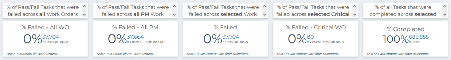
Task KPIs
These key performance indicators provide a snapshot of the current trends associated with your organization’s tasks.
-
Organization Fail %: This KPI shows the percentage of failed tasks across all work orders. This KPI is static, even if specific work orders are selected. It can serve as a comparison to the failure percentage of a specific work order by selecting one work order and looking at the KPI directly below. This KPI will update if other filters are selected, such as site, asset, or a date range. *Note: This KPI only considers Pass/Fail Tasks.
-
% Failed on PM: This KPI shows the percentage of failed tasks across all PM work orders. This KPI is also static, even if specific work orders are selected. It will update though if other segments are selected, like site, asset, or a specific date range. *Note: This KPI only considers Pass/Fail Tasks.
-
% Failed: This KPI shows the percentage of failed tasks for any selected work orders. If no work orders are selected, it will display the percentage of failed tasks for all work orders and will match the KPI above. *Note: This KPI only considers Pass/Fail tasks.
-
% Completed: This KPI shows the percentage of tasks that have been completed and will update to reflect any selected filters. This KPI considers all task types, so it is necessary to filter by certain task types if you would like to see the percentage completed for only certain tasks.
-
% Failed – Critical: This KPI shows the percentage of failed tasks for any selected critical work orders. Critical work orders are determined by a keyword search on the Work Order priority field.*Note: This KPI only considers Pass/Fail tasks.
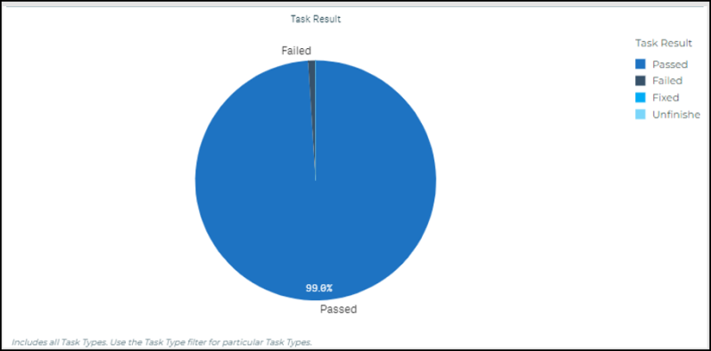
Task Result
This chart shows a breakdown of the results associated with your organization’s tasks. The chart includes all task types and will update with any filters that you select.
Count of Failed Tasks by Site/Location: This chart shows a breakdown of the count of failed tasks by site or location. This chart only includes Pass/Fail tasks. Use the triangle icon to switch between site and location. This allows you to quickly deep dive into certain sites or locations of interest.
Count of Failed Tasks by Asset/Task: This chart shows a breakdown of the count of failed tasks by asset, task, or PM schedule. This chart only includes Pass/Fail tasks. Use the triangle icon to switch between asset, task, and PM schedule. This allows you to further filter down to particular assets, tasks, or PM schedules.
Work Order Workflow and Resolution Work Order
This container object contains two tables that provide information to help you better understand the relationship between your work orders and tasks.
Work Order Workflow
This table shows the detail around connected work orders at your organization. The table includes information around work orders and any tasks and resolution work orders that are connected to the initial work orders, including: work order status, work type, work requested, associated task names, associated task types and results, and associated child or resolution work order identifiers and statuses.
Resolution Work Order Detail
This table provides more detail around resolution work orders connected to the initial work orders. You can use this table to filter down to certain work orders with failed tasks. This table allows you to quickly see the follow up work orders to ensure the tasks are completed.
Detail Tables
This container object contains two tables that provide additional information about your work orders and your tasks. You can toggle between the tables by selecting the tab with the name of the table you would like.
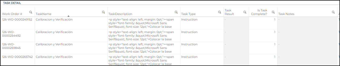
Task Detail
This table shows the detail related to your organization’s tasks. It includes information around the work orders and associated tasks, including the task name, task description, task type, task result, notes, any associated assets, and whether or not the task was complete.
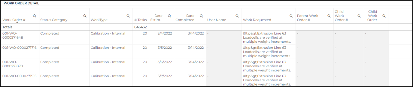
Work Order Detail
This table shows the detail related to your organization’s work orders. It includes information around the work orders, including work order status, work order type, the number of associated tasks, the date estimated vs. completed, the associated user, the work requested, and information on associated work orders (parent and child). Selecting one work order will update both the Task and Work Order Detail tables and allow you to do a deep dive into all task and work order details.