Back to Asset Essentials Main Menu
Inventory dashboard
The Inventory dashboards allows you to see your organization's on-hand inventory, as well as usage in recent history. *Note: Not all clients are eligible for Analytics. To learn if you are eligible, contact Client Services.
There are five dashboards available:
-
Parts Summary provides an overview of on-hand quantity and value of parts by location and category.
-
Part Transactions looks at transaction history of parts over the past few years.
-
Inventory Turnover details how part value has changed over time and includes information on Slow Moving parts.
-
Purchase Orders contains information on your organization’s purchase order activity.
-
Work Order Parts with Assets focuses in on part usage specifically related to Assets via Work Orders.
Your dashboard updates every morning with the current year's data through the previous day as well as two previous calendar years of data. You can see the Last Updated time stamp in the top left corner of your dashboard. *Note: Time shown is in Eastern time zone.

Inventory dashboards
To access the Inventory dashboards:
-
Click the Maintenance menu icon, then select Inventory Dashboard.
-
Use the View by: drop-down in the top center of the screen to select the dashboard you want to view.
-
There are a number of filters to the left of the dashboards that allow you to drill down to specific information. The filters are similar to the ones that appear on other dashboards in Analytics, but also include inventory-specific filters, such as Part Name and Transaction Type.
This dashboard provides you with a summary of on-hand quantity as well as the value of parts by location and category, giving you a snapshot of current inventory status across your organization.
At the top of the page, there are three KPIs (Key Performance Indicators) related to current inventory status.

-
Unique Parts is a count of the number of distinct parts that have existed in your organization’s inventory.
-
On-Hand Value is calculated by multiplying the current quantity on-hand by the unit cost over the time frame for each part.
-
On-Hand Quantity is a sum of the current quantity in inventory.
-
Dollar value is calculated by multiplying the current quantity on-hand by the average cost over the time frame for each part.
-
If an individual part’s quantity on hand is greater than or equal to 100,000,000, it is considered an extreme outlier and is excluded from the metrics and visualizations.
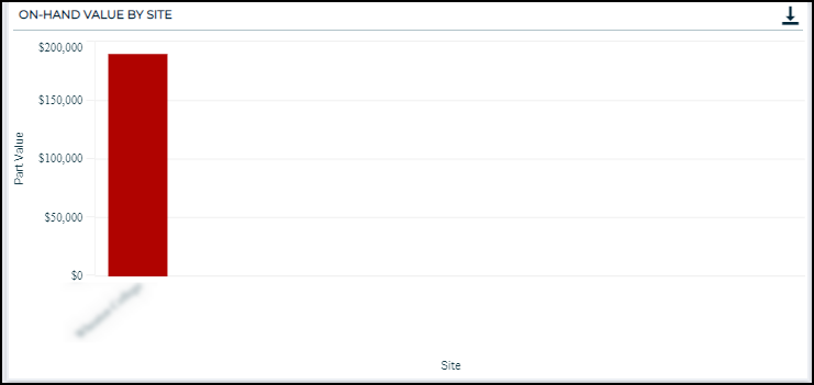
On-Hand Value by Site
A bar chart that displays the on-hand part dollar value at each site.
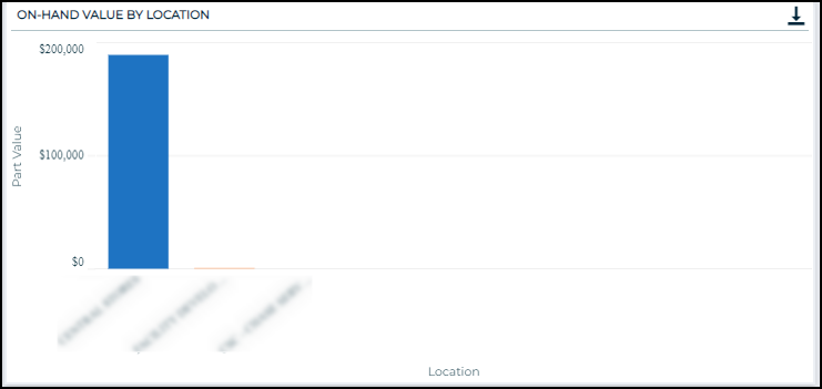
On-Hand Value by Location
A bar chart that displays the on-hand part dollar value at each location.
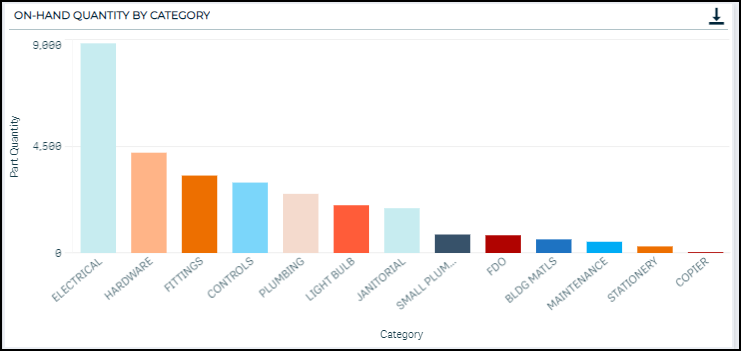
On-Hand Quantity by Category
A bar chart that displays the on-hand part quantity by each part category.
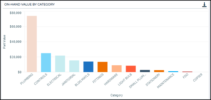
On-Hand Value by Category
A bar chart that displays the on-hand part dollar value by each part category.
Part Details
An interactive table displaying the raw part detail data. This data shows a snapshot of inventory at the time of data reload, including part characteristics, current quantities, and on-hand value.

This dashboard displays inventory data over time. The time frame includes the previous two calendar years plus the current year (based on transaction date).
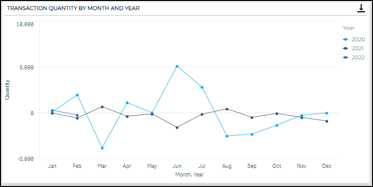
Transaction Quantity by Month and Year
This chart displays the sum of transaction quantity by month and year. By overlaying the years on top of each other, you can see how your monthly transactions compare year over year. This also serves to highlight any seasonal trends that recur on a yearly basis. *Note: It may be beneficial to filter by transaction type using the filter option to the left of the charts. This allows you to focus on purchased parts or dispatched parts, for example.
Transaction quantity is calculated by subtracting “quantitybefore” from “quantityafter” (ie. Quantity = Quantity After – Quantity Before). If Quantity After – Quantity Before > 100,000,000, that transaction is considered an extreme outlier and is excluded from the visualization.
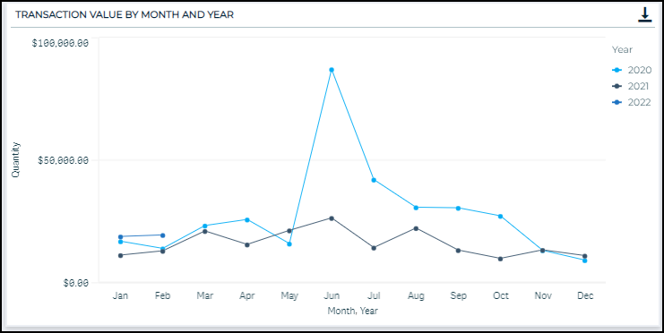
Transaction Value by Month and Year
This chart sums and displays the total dollar value tied to transactions by month and year. By overlaying the years on top of each other, you can see how the dollar value of all your monthly transactions compare year over year. Using this chart in conjunction with the Transaction Quantity by Month and Year chart, you can see if the cost associated with part transactions have changed year over year if the quantity of transactions is similar. *Note: It may be beneficial to filter by transaction type using the filter option to the left of the charts.
Transaction value is calculated by taking the absolute value of Quantity and multiplying by Price After. If the absolute value of Quantity is greater than 100,000,000, that transaction is considered an extreme outlier and is excluded from the visualization.
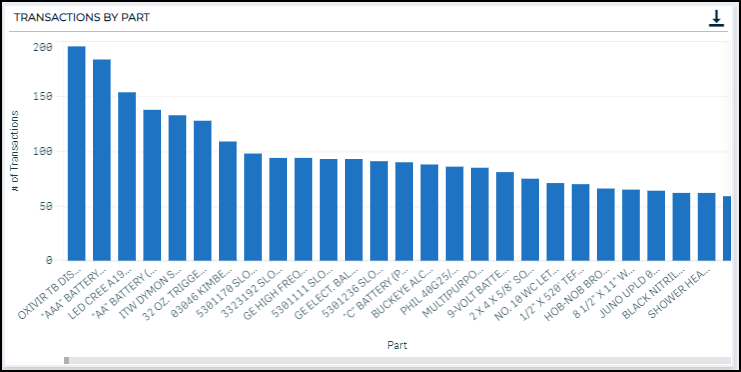
Transactions by Part
This chart looks at the number of transactions over the time frame by Part Name. It gives you a quick glimpse into the parts that are being transacted more than others. *Note: It may be beneficial to filter by transaction type using the filter option to the left of the charts. This allows you to drill down and quickly see if you have ordered a large number of a certain part or used a large number of a certain part over the time frame.
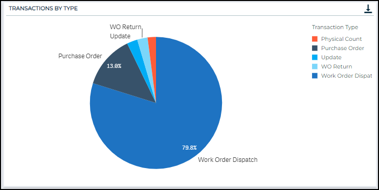
Transactions by Type
This pie chart breaks down the types of transactions used. *Note: It may be beneficial to filter down to a particular part using the filter options to the left of the chart. This allows you to see which transaction types are used with certain parts. For example, if one part has primarily “Update” transaction types, it may indicate that this part is not being accurately recorded when it is dispatched or ordered.
Number of Unique Work Orders Tied to Part Transactions
This chart displays the number of work orders that are tied to part transactions.
The reference line that appears as a dashed line on the chart represents the best-fit regression line. The linear trendline is derived by minimizing the sum of squared errors, or essentially minimizing the distance between the trendline and each actual value. The trendline is fit using the linear regression equation, y = mx + b.
The trendline highlights the trend over time of the number of work orders tied to part transactions. The purpose of this chart is to display any trend associated with the parts that are associated with work orders over time. An upward trend indicates that the number of work orders tied to part transactions is increasing, which may reveal that more parts are being used in work orders, and therefore more parts may need to be ordered going forward.

Transaction Details
An interactive table displaying the raw transaction data.

This dashboard provides a summary of inventory turnover over the time frame, which includes the previous two years plus the current year. The charts and tables on this dashboard can be heavily affected by parts with few transactions, so we recommend that you filter on a certain part or part category to make this dashboard the most useful. You can also filter by the Turnover Transaction Type, if you wanted to exclude a certain type, such as Update or Physical Count.
At the top of the page, there are three KPIs:

-
Turnover Ratio
-
The inventory turnover ratio is calculated at the end of each month and compares the dollar amount of transactions that occurred during the previous 12 months (excluding purchase orders) to the total inventory value at the end of a given month. This value is displayed as of the previous month-end.
-
The ratio gives an indication of how quickly your MRO inventory (parts) are being used or “turned over”. It helps answer the question: How effectively is my organization using our inventory investment? For reference, if the inventory turnover ratio is 1, it means the total value of inventory used over the last year is equal to the current total inventory value.
-
-
Transaction Value
-
This KPI represents the numerator of the Inventory Turnover Ratio calculation. It is derived by calculating the dollar value associated with all part transactions (excluding purchase orders) during the previous 12 months.
-
-
Inventory Value
-
This KPI represents the denominator of the Inventory Turnover Ratio calculation. It is derived by multiplying the quantity by cost for each part, as of the previous month-end.
-
Inventory Turnover Ratio
As mentioned above, the inventory turnover ratio is calculated at the end of the month and it compares the dollar amount of transactions that occurred during the previous 12 months to the total inventory value at the of the month.
The reference line that appears as a dashed line on the chart represents the best-fit regression line. The linear trendline is derived by minimizing the sum of squared errors, or essentially minimizing the distance between the trendline and each actual value. The trendline is fit using the linear regression equation, y = mx + b. The purpose of the trendline is meant to highlight whether inventory turnover has been increasing or decreasing, or if the turnover has been steady over time.

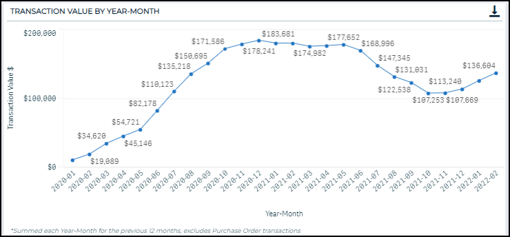
Transaction Value by Year-Month
This chart represents the numerator of the Inventory Turnover Ratio calculation. This chart represents the numerator of the Inventory Turnover Ratio calculation. This chart is derived by summarizing the dollar value associated with all part transactions during the last 12 months. Purchase order transactions are not included in this summary include because these types of transactions do not indicate that a part has been used.
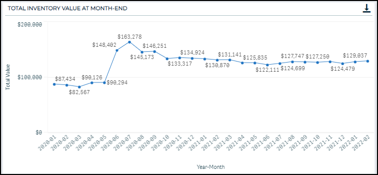
Total Inventory Value at Month-End
This chart represents the denominator of the Inventory Turnover Ratio. This chart is created by summing the total value of inventory at the end of each month.
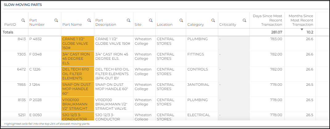
Slow-Moving Parts
This table includes the days and months since the last transaction for each part. The location and category for each part are also included for ease in filtering.
-
The table is automatically sorted to have the part with the highest number of days since last transaction at the top.
-
The top 25% of values for number of days since last transactions are highlighted in orange, to quickly identify parts that may be slow moving.
-
The purpose of this chart is to offer the ability to drill down into inventory that has not been transacted in a long amount of time. This may aid you in cleaning out old or expired inventory, as well as postponing purchase orders to utilize overlooked inventory.
The Purchase Orders dashboard displays information related to your inventory purchase orders. *Note: It may be beneficial to filter by part, part category, or location as you view these charts.
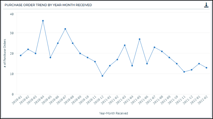
Purchase Order Trend by Year-Month Received
This chart displays the number of purchase orders that were received each month. The purpose of this chart is to highlight months that had a large number of purchase orders, as well as display whether the number of purchase orders has been steady over time or increasing/decreasing.
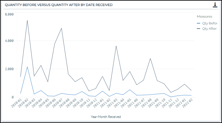
Quantity Before versus Quantity After by Date Received
This chart shows how the quantity before and quantity after fields change over time with purchase orders. This chart will highlight when large numbers of parts have been ordered. Similarly, by overlaying the two quantity fields, this chart also provides a visual display of whether the number of parts ordered is consistent over time or not.
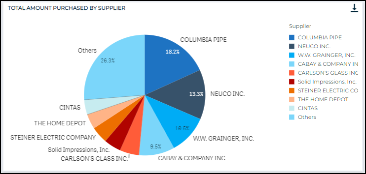
Total Amount Purchased by Supplier
This pie chart displays the purchase order total part amount dollar value by supplier over the time frame, expressed as a percentage.
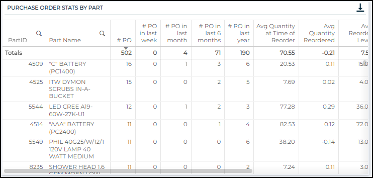
Purchase Order Stats by Part
This table provides a look at purchase order trends over time in tabular format. This table provides a purchase order (PO) summary for each part: total purchase orders (over the time frame), the number of POs in the last week, the number of POs in the last month, the number of POs in the last six months, and the number of POs in the last year. These summaries are meant to highlight increasing or decreasing trends in the number of Purchase Orders for parts.
Additionally, we have summarized the average quantity on-hand at the time of reorder, the average quantity of each part reordered, the average user-provided reorder level, and the total shipping cost. These numbers are meant to highlight areas of opportunity. For example, if a certain part has been ordered many times, but only a few have been ordered, perhaps there is an opportunity to make a larger order fewer times per year.
Purchase Order Details
An interactive table displaying the raw purchase order transaction data.

The purpose of this dashboard is to give you an understanding of how your inventory, assets, and maintenance operations are all tied together.
The three charts on this dashboard are useful in providing the full picture of the data points by asset, but it may also be beneficial to select one asset. In selecting one asset, you will be able to answer the following questions at an asset level:
-
How many parts have been dispatched to fix this asset?
-
How many maintenance requests (i.e., work orders) have been created for this asset over the time frame?
-
For all the related maintenance requests, which parts have been the most or least costly?
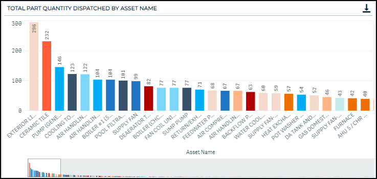
Total Part Quantity Dispatched by Asset Name
This chart displays, at an asset level, the number of parts that were dispatched and associated with the asset in the system. This chart provides a quick look at which assets are associated with the highest number of dispatched parts, and therefore, seem to be receiving a higher percentage of your resources for repair. This could be used to highlight assets that should be replaced, rather than repaired continually.
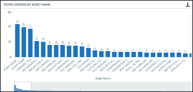
Work Orders by Asset Name
This chart displays the number of work orders that have been associated with an asset over the time frame. Again, this highlights the assets that have had the largest number of maintenance requests.
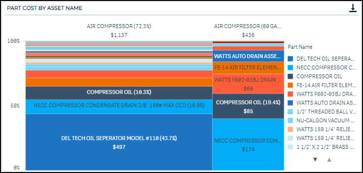
Part Cost by Asset Name
This chart displays the costs for each part associated with each asset. This chart separates information for assets by column and fills each column with rectangles that represent the percentage of total cost associated with each part. Larger rectangles imply that those parts have accounted for a larger proportion of total spend associated with an asset. It is most easily understood if you first filter down to one or a few assets.
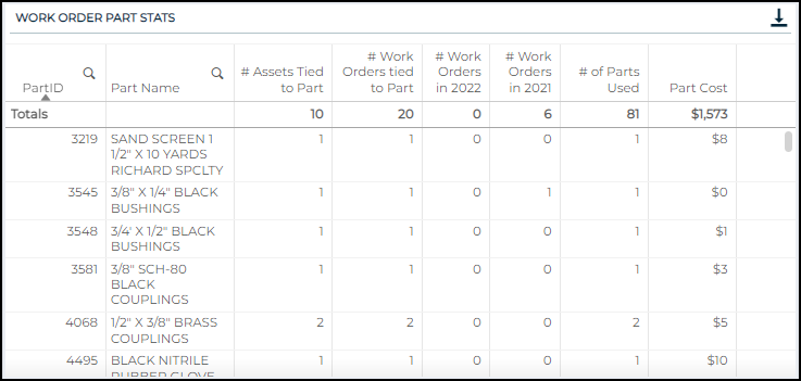
Work Order Part Stats
This table displays summary data by Part. This table allows you to drill down to specific parts to see how many work orders and assets they are tied to. Additionally, there are some other summary statistics provided around part use. The purpose of this table is to highlight parts that are used in many places, as well as parts that have had increasing or decreasing use in recent times.
Work Order Part Details
An interactive table displaying the raw work order part data.

