Back to Dude Intelligence for Manufacturing Main Menu
Trends allow you to have a historical view of performance to understand your teams' improvement over time. You are able to drill down on specific trends to gain a greater understanding of your teams' performance.
This data updates every month and includes 3 calendar years of data in addition to the current year to the end of the previous month. For example, if you are viewing trends in March 2017, you will see all data from the calendar years of 2014, 2015, and 2016, along with the data from January and February of 2017.

- You can click on a line within a Trend to filter the data on all the trend graphs according to that line.
- To download an image of the graph, click on the download icon (
 ).
). - To expand the graph you are viewing, click on the fullscreen icon (
 ).
). - To export your KPI data into an Excel spreadsheet, click on the Excel icon (
 ). *Note: This will only export the data, not the graphs.
Trends
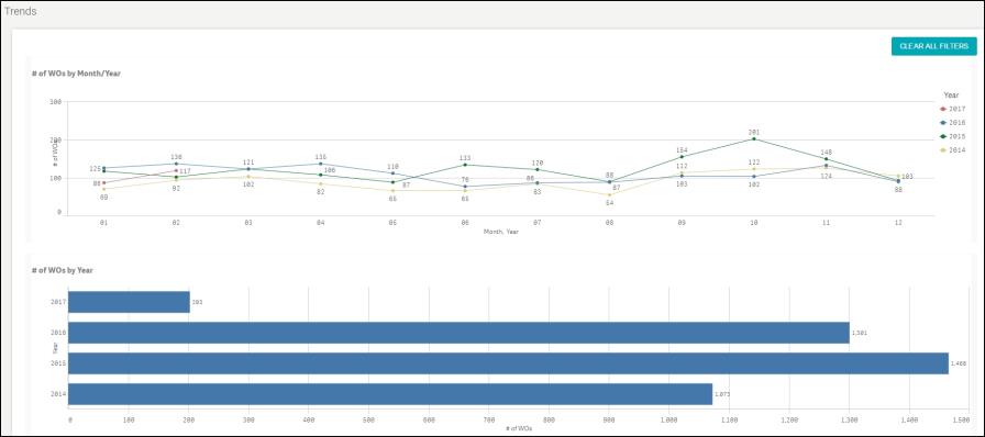
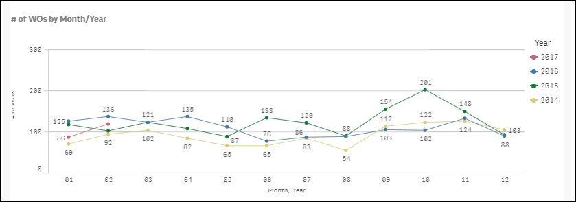
This graph displays the total number of work orders created each month in a given calendar year. You are able to compare different years by looking at an alternate line on the graph.

This graph displays the total number of work orders created in a given calendar year.

This graph displays the percentage of Completed or Closed corrective work orders completed in 7 days or less each month for a given year. You are able to compare different years by looking at an alternate line on the graph. *Note: This percentage only includes work orders with a priority of Low, Medium, or High.

This graph displays the percentage of Completed or Closed corrective work orders completed in 7 days or less in a given calendar year.

This graph displays the average number of work orders assigned to Maintenance Technicians each month for a given calendar year based on a 47 week year. You are able to compare different years by looking at an alternate line on the graph. *Note: For a technician to be included in this graph, they must have at least 30 but less than 2000 work orders assigned to them.

This graph displays the average number of work orders assigned to Maintenance Technicians entered for a given calendar year based on a 47 week year. *Note: For a technician to be included in this graph, they must have at least 30 but less than 2000 work orders assigned to them.

This graph displays the average number of hours worked by a Maintenance Technician each month for a given calendar year based on a 47 week year. You are able to compare different years by looking at an alternate line on the graph. *Note: Employees must have between 500 and 3000 labor hours entered during the 12 month time period to be included in this Trend.

This graph displays the average number of hours worked by a Maintenance Technician for a given calendar year based on a 47 week year. *Note: Employees must have between 500 and 3000 labor hours entered during the 12 month time period to be included in this Trend.

This graph displays the percentage of requests entered by Requesters each month for a given calendar year. You are able to compare different years by looking at an alternate line on the graph.

This graph displays the percentage of requests entered by Requesters for a given calendar year.

This graph displays the percentage of Completed or Closed preventive maintenance work orders compared to all Completed or Closed work orders each month for a given calendar year. You are able to compare different years by looking at an alternate line on the graph.

This graph displays the percentage of Completed or Closed preventive maintenance work orders compared to all Completed or Closed work orders for a given calendar year.

This graph displays the percentage of Completed or Closed preventive maintenance work orders completed in 30 days or less each month for a given calendar year. You are able to compare different years by looking at an alternate line on the graph.

This graph displays the percentage of Completed or Closed preventive maintenance work orders completed in 30 days or less for a given calendar year.

This graph displays the number of hours spent on Completed or Closed planned maintenance work orders each month for a given calendar year. You are able to compare different years by looking at an alternate line on the graph.

This graph displays the number of hours spent on Completed or Closed planned maintenance work orders for a given calendar year.

The bar graph displays the total number of Complete or Closed corrective work orders entered each month for a given calendar year. The pink trend line allows you to see what percentage of those work orders were completed in 7 days or less.

The bar graph displays the average number of work orders that were assigned to Technicians each month for a given year. The pink trend line allows you to see the average hours worked each week for that month.

This graph displays the number of Completed and Closed planned maintenance work orders versus Completed and Closed non-PM emergency work orders entered each month for a given calendar year.

